Improving Gift Giving through Usability Insights


What is Drawnames ?
Drawnames is an app designed to simplify celebrations like Secret Santa, Thanksgiving, or even Birthdays. It lets users create a celebration, invite participants, draw names, and share wish lists anonymously or otherwise.
My Role
Lead Evaluator
Team
One lead evaluator and two secondary evaluators.
Duration
2 Weeks

Secret Santa is fun in theory, until you’re the one stuck organizing it!
So,
I evaluated the Drawnames app to uncover usability gaps and improvement opportunities.

Ambiguity in joining, organizing, or finding celebrations.
Ambiguous Call to Action while creating a celebration
Frustration Joining Existing Celebrations
No Quick Nudge Feature for Celebration Members
A glimpse of what I improved
Before diving into the evaluation, here’s a quick teaser of areas that were refined to elevate the Drawnames experience.

More joyful & clearer celebration dashboard
Clear choices for setting up celebrations

Smart nudges for faster participation
User Journey
To evaluate the core Drawnames experience, I focused on one end-to-end scenario:
"Create and explore a Secret Santa celebration with classmates"
Identifying User Pain Points
Through the Usability Evaluation, I identified four major challenges that were making the user journey more complex than it needed to be.
Redesigning the Celebration Tab
Redesigned the celebration screen to surface all celebrations as cards, enabling quick access and smoother navigation between celebrations.
BEFORE
AFTER
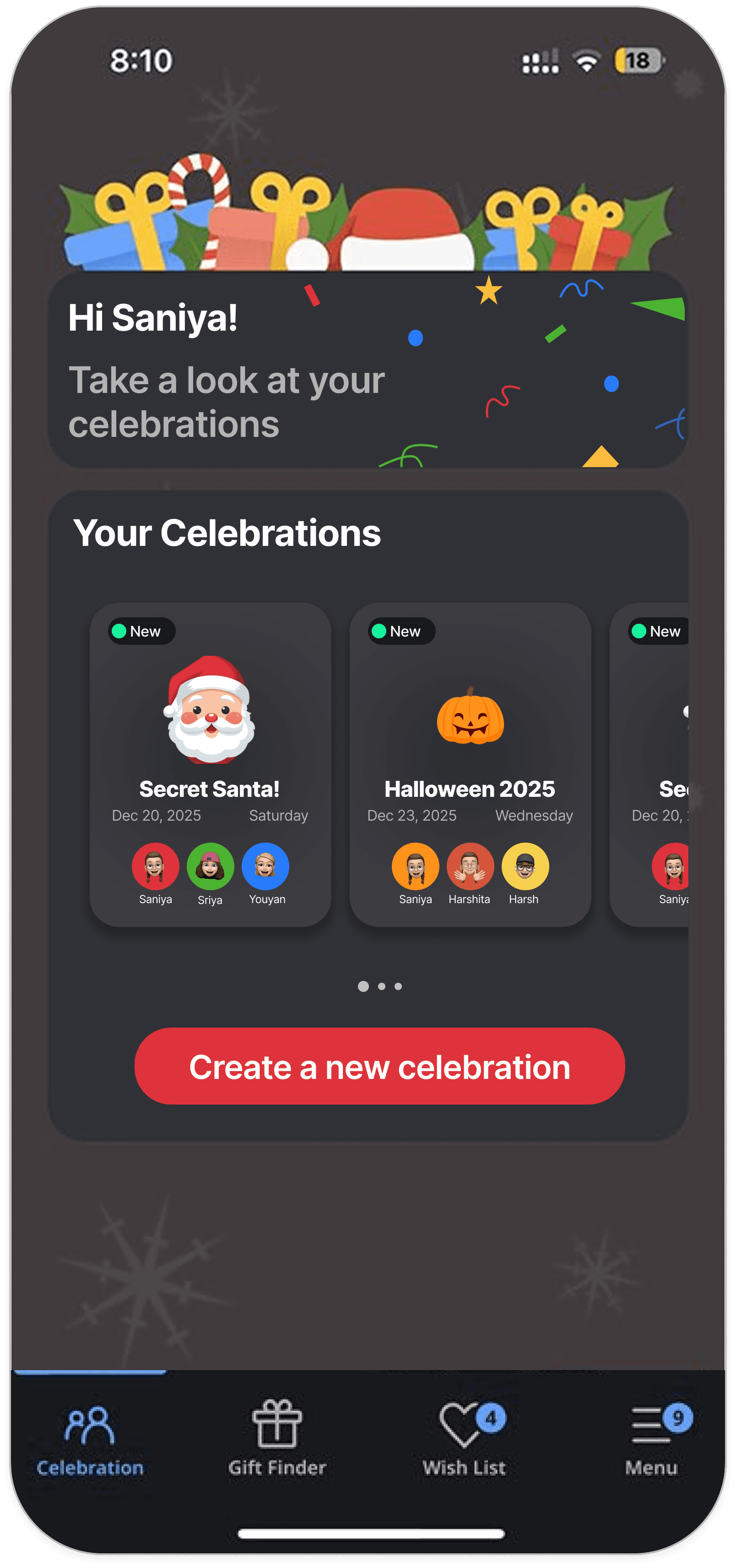
UI Enhancements : Confetti elements for a festive vibe, making the celebration dashboard feel more inviting.
'New' Signifier on Cards: Highlights recently joined celebrations, making discovery easier.
Participant Avatars :
Visually represents
members in each celebration
Celebration Cards : By displaying all of the user's active celebrations as swipeable cards, users can browse and manage every celebration they're part of at a glance.
Clear UX Copy : Sets user expectations for the tab’s purpose.
All my celebrations, easy to find!

But, Why does this work ?
Reduced the celebration flow from 7 steps → 4 steps, improving task efficiency.
BEFORE REDESIGN : Complex Navigation

Launch App

Single Celebration View
Menu
My Celebrations

List of Celebrations

Select Celebration

Perform Task
AFTER REDESIGN : Simplified Journey
Launch App
All Celebration Cards
Select Celebration
Perform Task
Fixing Confusing Copy
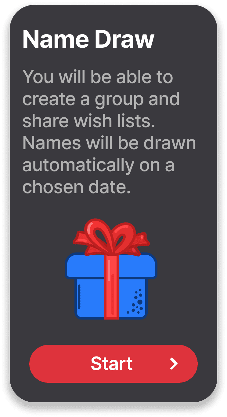
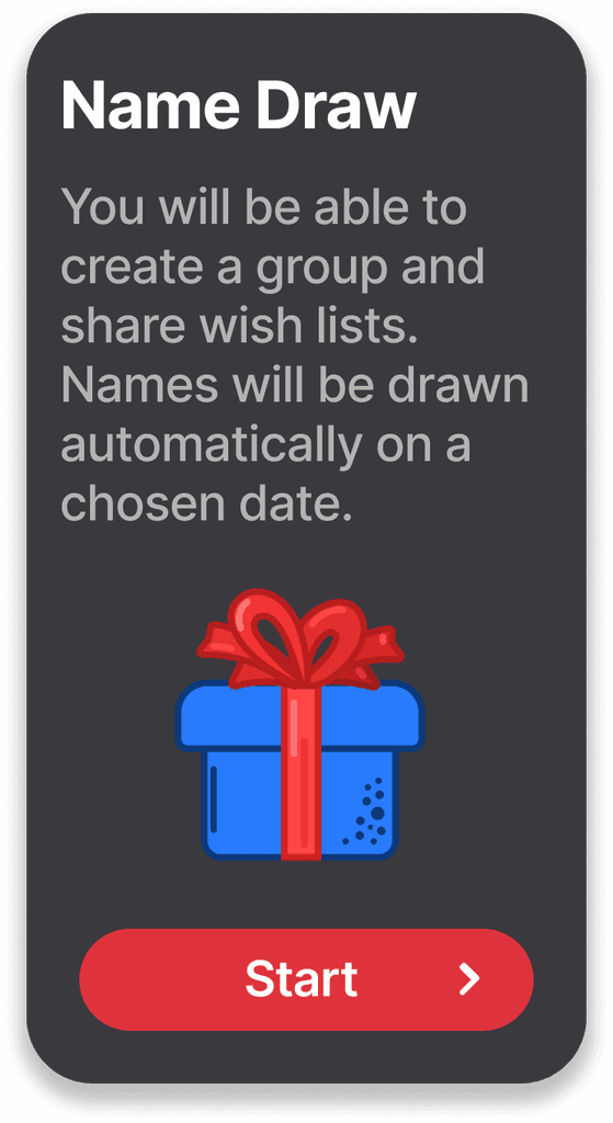
The CTA “Start drawing names” confused users about whether they were starting a new celebration or drawing a name.
BEFORE

The description was misleading and confusing, ‘create a group’, but How ?
The CTA copy gave an impression of drawing a name without creating or joining a celebration ?
I want to create a Celebration, can I directly draw names ?

Changed the UI to focus on the Icons instead of the CTA for easier understanding.
I can create a celebration and also just share wish lists!
AFTER
What I was thinking?

FINAL VERSION
INITIAL IDEA

Moved Icon below
text to make it easier to read.
Clear copy for an action oriented Task.
Explaining task by using appropriate words to avoid confusion.
Title mentions just 1 action and subtitle gives clarity on what the action is.
Both cards have a consistent design and it is easier to read now.
Outcomes!
Reduced navigation from 7 steps to 4
Clearer UX Copy and Action Labels
Improved visibility of celebrations and options
and
THAT'S ALL FOR THIS CELEBRATION
No elves were harmed during the making of this redesign


Let's Brew something Fun together!
GET IN TOUCH : saniya.jain2401@gmail.com
c
2026 Saniya Jain.
Definitely not my first draft:)