

The behaviour-tree workspace for AMRs

TL;DR
Magna is a global mobility supplier, best known for the hardware behind cars most people drive. Its New Mobility division extends that into software: fleet management platforms for industrial operations, built for the operators and admins who coordinate work across a facility every day.
As a UX Designer across four products on the platform, I led the design of the Mission Template Editor, a configuration tool solution architects use to define the missions AMRs 🤖 carry out. My work spans user research, interaction design, and partnering with engineering to translate complex technical domains into usable interfaces.
ROLE
Lead UX Designer
TEAM
Lead Designer, Design Manager, Developer, Engineering Lead
TIMELINE
June 2026; 08 Weeks
What if you opened the web one day and couldn’t read a single word?
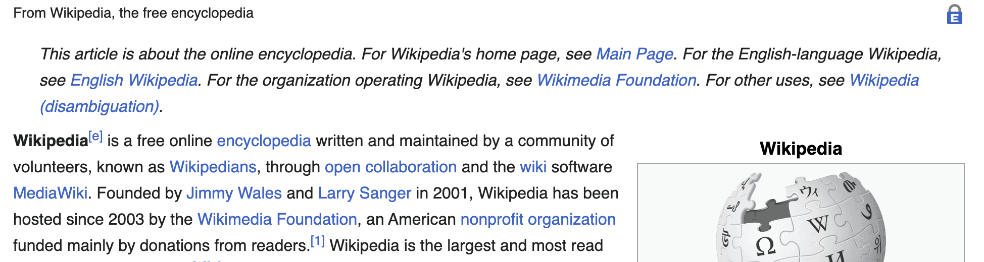
Felt annoying right?
For many users with disabilities, this is a part of how they experience the web every day.

THE PROBLEM

Wikimedia Foundation wanted to better understand how
users with disabilities experience the Wikipedia Android app and identify opportunities to make the platform more accessible and inclusive.
THE SOLUTION

We Audited Wikipedia's Android app
90
Accessibility issues identified
28
UX & Dev Recommendations
29
WCAG Guidelines Tested
UNDERSTANDING OUR USERS
Wikipedia’s audience is everyone, which means the experience should be accessible to everyone
To better understand diverse accessibility needs, we created user personas grounded in research across visual, hearing, motor, and cognitive disabilities.
THE EVALUATION

We stepped into Martha and Ryan’s everyday experience
by navigating the app using the assistive technologies and accessibility settings they depend on.
SEVERITY OF ISSUES
We prioritized our findings into 3 tiers based on severity
Findings were prioritized based on how severely they impacted a user’s ability to independently navigate, understand, and complete tasks within the app.

DIVING INTO THE FINDINGS
Now let's take a look at some of the most critical issues
ISSUE 1
TalkBack struggled to communicate the interface
Important navigation cues, labels, and contextual information were inconsistently announced, making it difficult for TalkBack users to understand and navigate the experience independently.


DEV RECOMMENDATIONS
How can we improve this?
01
Add accessibility labels
02
Define semantic roles
03
Improve Talkback feedback
04
Preserve Navigation Heirarchy
ISSUE 2
The map experience excluded Non-touch users
Core map interactions relied entirely on gestures, making navigation difficult for users relying on Voice Access, Talkback, or keyboard navigation.

DEV RECOMMENDATIONS
How can we improve this?
01
Add accessible zoom controls
02
Expose pins as focusable elements
03
Enable full keyboard navigation
Check out all the detailed findings here
OUTCOME
We didn’t realize how many accessibility barriers existed for users relying on external keyboards. That’s something we would definitely want to prioritize moving forward.
~ Wikimedia's Design Team

MY TAKEAWAYS
01
Accessibility is not just about “screen readers”
02
One interface can create completely different experiences
03
Accessibility becomes real when you experience the barriers yourself
04
Some users rely on interactions most products never consider
Behind the scenes



A big shoutout to the team for making this project so fun and impactful and to Prof. Liza Burroughs for her guidance throughout.
Let's Brew something Fun together!
GET IN TOUCH : saniya.jain2401@gmail.com
c
2026 Saniya Jain.
Definitely not my first draft:)
